November 24, 2021, 3:31 pm EST
Deteriorated Breadth Readings
When looking at the all-time highs of indexes like S&P500 or Nasdaq or even Dow Jones, their price charts look perfect with a straight rising line since March 2020. But, the breadth readings may be totally different pictures because indexes use weighted formulas according to the market capitalization of each stock.
It means that Apple (AAPL) or Amazon (AMZN) takes more weight than small-cap stocks when calculating the index price numbers. It is a fair calculation because mega-cap stocks (AAPL, AMZN, GOOGL, FB, MSFT) are much more influential for the overall markets than others.
But, if we want to know the breadth pictures of the stock market, then each stock takes one vote only. It gives us the breadth readings of the market. We can use reference lines like short term, 20 Day-Moving-Average, medium-term (50 DMA), or long term (200 DMA) to draw their charts as:
- Percent of Stocks Above 20 Day Average (MMTW)
- Percent of Stocks Above 50 Day Average(MMFI)
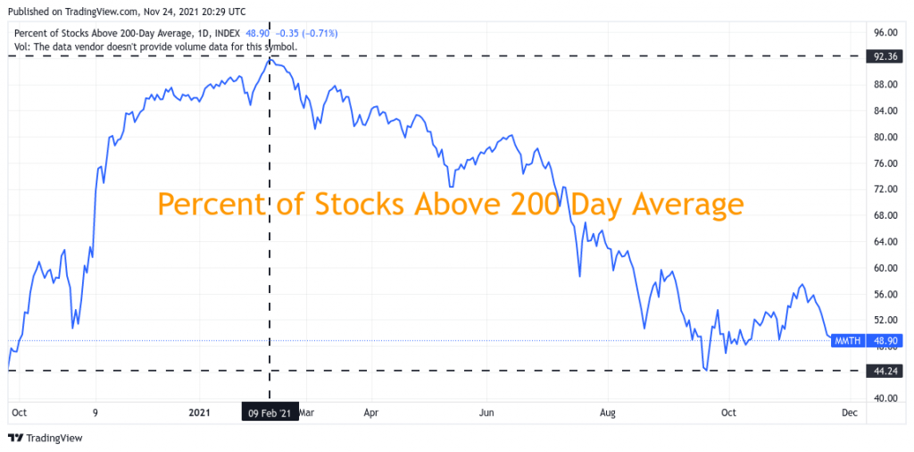
- Percent of Stocks Above 200 Day Average (MMTH)
The featured chart uses 200 DMA (MMTH) to illustrate the market breadth. We can see clearly that it top-out on February 9, 2021. It was a straight downward action to below 50% level since late September 2021.
This chart looks almost opposite to the price chart. It means that there are fewer stocks or small groups of mega stocks that lead the indexes. We can also say that the chance to make a good trade became harder since February unless the traders have high hitting rates on picking the winning stocks.
Having this picture in mind is important to realize that stock markets are not as bullish as it looks. More importantly, stock picking becomes more crucial to make a profitable trade.